How do UK/Scottish taxes on wages compare with other countries’? It’s a simple question – but not straightforward to answer.
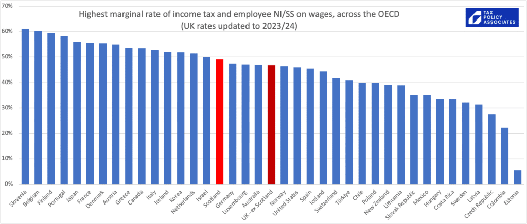
Looking just at rates is misleading. This chart1, for example, suggests that the top rate of UK tax is comparable with the US. That’s not really right. In the US, the top rate of Federal income tax (and, often, state income tax) kicks in at $523,600. The top UK rate – now 45% – applies from £125,140. So for most reasonably high-earning people, tax rates in the US are significantly less.
A better question is, what’s the effective tax rate – the “tax wedge” on any given amount of income?
My answer is this chart – and you can click on it for an interactive version that lets you add/remove countries:

Some immediate conclusions:
- The UK/Scotland has a much lower effective tax rate on average wages, and lower than average wages, than almost every other developed country.
- This then starts catching up quite quickly once we approach twice the average wage. And once we’re on high incomes, UK effective rates look a bit more average. Less than the expansive Continental welfare states. More than smaller countries, the US, and other countries with much less generous welfare states.
- So a good case can be made that the UK is undertaxed by international standards. That’s not something many people in the UK believe, but it doesn’t stop it being true…
Quick notes on where the data in the chart comes from:
- The chart is generated by some simple code, that takes worldwide data for tax rates and threshold (from the wonderful OECD tax database), applies it to different income levels.
- The effective tax rates include employer national insurance/social security.2 We don’t see employer wage taxes in our wage slips, but evidence suggests it is mostly borne by workers.3
- The x axis isn’t an absolute dollar amount, as realistically we can’t compare taxes on £100k in the UK with £100k in Costa Rica. Instead, the x axis is a multiple of average wages – so we are comparing tax on (e.g.) the UK average wage with tax on the Costa Rican/French/etc average wage.4
- The chart doesn’t take account of tax reliefs/deductions – these are generally quite limited in Europe, but very generous in the US… so again the chart overstates the actual tax Americans pay.
- The data is now updated for the 2023/24 UK and Scottish rates, but other countries are not updated (I have no good source for the data). Given the wider economic circumstances, it’s plausible that taxes will be going up worldwide, and so this chart may make the UK/Scotland rates look relatively higher than they actually are.
- See my previous post for more detail on the methodology and a complete list of caveats and limitations.
And if you don’t want to believe my chart, here’s the OECD’s own chart showing the effective rate of tax on average incomes:5

I continue to think that, if we want a Scandinavian level of public services, then most people have to pay similar levels of tax to most people in Scandinavia. Sorry about that.
Photo by Javier Miranda on Unsplash